Stop Drawing Processes — Start Running Them
A flowchart is a picture; a process is a system. Why the most useful way to document and analyse how work flows isn't a static map, but a model you can run under load — and watch the bottleneck appear.

Stop Drawing Processes — Start Running Them
Almost every process improvement starts the same way: someone opens a drawing tool and maps the as-is. Boxes for steps, diamonds for decisions, arrows for the flow. It feels like progress, and it is — a shared picture beats a dozen private mental models. But then the picture goes on a wall, and the wall is where most process work quietly dies.
The problem isn't the drawing. It's that a flowchart can only show you the shape of a process, never its behaviour. And almost every interesting question about a process is a question about behaviour.
A flowchart is a picture. A process is a system.
Look at any process map and ask the questions that actually matter: Where does work pile up when demand spikes? Which step decides the throughput of the whole chain? If we add one person here, what happens three steps downstream? What's the realistic spread of how long a case takes — not the average, the spread?
A static diagram has nothing to say about any of this. Boxes don't queue. Arrows don't wait. The map looks equally calm whether the process is humming along or collapsing under a Monday backlog. It captures what connects to what and stays silent on the only thing that costs money: what happens under load.
That's the gap. You documented the process, you can hand the diagram to a new hire, and you still can't answer the one question your client or your board is actually asking — where is the constraint, and what is it worth to fix it?
The shift: from a map to a model you can run
The more useful way to think about documentation is not "a drawing of the steps" but "a model that behaves like the real thing." The difference is that a model has the missing dimensions baked in:
- Each step has a capacity and a duration — how much it can handle, how long it takes — instead of being a featureless box.
- Work arrives over time, with volume that swings and peaks, instead of an arrow that implies a smooth, infinite stream.
- Steps depend on each other — a downstream team can only ever process what the upstream step lets through.
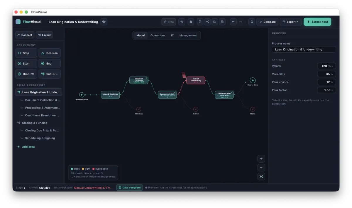
Give a process those properties and you can do something a flowchart never allows: you can press play. Feed in a realistic stream of work and watch it flow. Where a step can't keep up, the queue in front of it grows and the load climbs past 100%. That's your bottleneck — not asserted in a workshop, but observed, the same way it would reveal itself in reality, only faster and without the cost of finding out the hard way.
Why this beats intuition — and beats the average
Two instincts quietly sabotage process analysis. This approach fixes both.
The first is gut feel about where the problem is. Ask five people on a team to name the bottleneck and you'll often get five answers, each shaped by where that person sits. The loudest step isn't always the binding one. A model settles it by behaviour, not opinion: the step that overflows first, under realistic load, is the constraint — and frequently it's not the one anyone was blaming. The classic shape is a downstream team that looks slow but is actually starved: it's idle because the step feeding it can't keep up. Staff up the idle team and nothing moves. The map can't show you that. A running model shows it immediately.
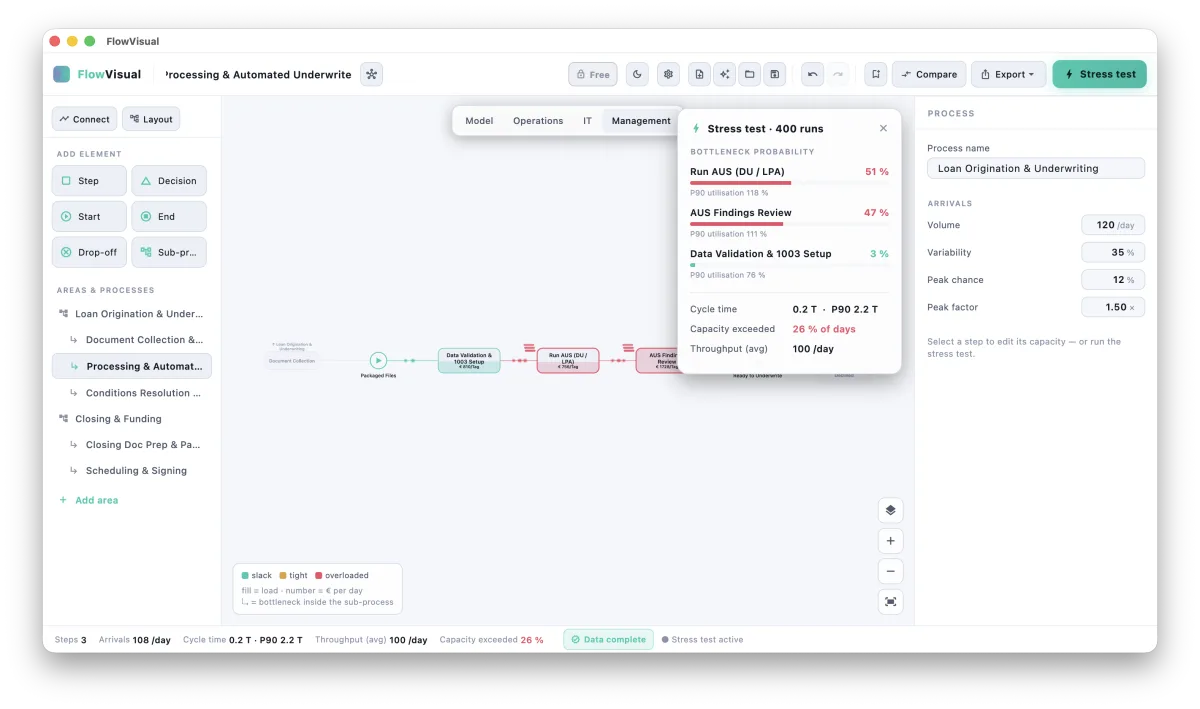
The second is the tyranny of the average. "This step takes 7.5 minutes" is a comforting fiction. Real steps take 5 to 10 minutes, demand is 80 to 130 cases a day, and it's precisely the bad-day combinations — peak arrivals meeting slow handling — that break a process. A single average hides exactly the variability that causes the pain. This is why running a process once with average numbers isn't enough, and why serious analysis leans on Monte Carlo simulation: run the process across hundreds of simulated days, each with its own realistic swings, and you stop asking "what happens on a typical day" and start asking the question that matters — how often does this step bind, and how bad does it get when it does? You get a P90, not a point. A range, not a rumour.
The point of analysis is a decision
Documenting and analysing a process is not the deliverable. The decision is. And decisions get made — or blocked — on whether the number behind them survives scrutiny.
A model you can run changes what you're able to put on the table. Instead of "I think the underwriting step is the problem," you can say "underwriting binds on 8 days out of 10, and here's the throughput it costs." Instead of "automating this should help," you can change one number — add a person, cut a handling time, automate a step — let the model rebalance, and read the before/after in cycle time and in euros per year. And because the inputs were ranges, the output is a range too: €120k to €180k a year, with the uncertainty carried honestly all the way through, rather than a single suspiciously precise figure that the first sceptic in the room will rightly distrust.
That honesty is the whole game. Numbers only win a room when they survive being pushed on. A model built from ranges, stress-tested across hundreds of days, with every figure traceable to an assumption you can defend, is built to survive exactly that.
What this means in practice
You don't need to model everything, and you shouldn't. The craft is choosing the few steps where capacity is genuinely tight and the variability genuinely bites — and being honest about your inputs. A model is only as good as its assumptions, which is why marking each number by where it came from (measured, estimated, guessed) matters as much as the simulation itself.
But the shift in mindset is the valuable part, and it's available whatever tool you reach for:
- Document the as-is as a model, not a mural — steps with capacity and duration, work that arrives over time, dependencies between steps.
- Use ranges, not false precision — and let that uncertainty flow to the result.
- Stress-test it — many simulated days, not one average run, so the bottleneck is ranked by how often it actually binds.
- Test the fix before you sell it — change one lever, watch the rebalance, read the before/after in time and in money.
A flowchart tells you the process exists. A model you can run tells you where it hurts, how much, and what fixing it is worth. For anyone who has to walk into a room and defend a change in front of people who will push back, that's the difference between "trust me" and "here's the math."
This is the thinking behind FlowVisual — a desktop process simulator we built for exactly this loop: model, stress-test, prove the fix in euros. It's in public beta for Windows and macOS, fully local, no account. If the approach resonates, it's worth a look — but the approach matters more than the tool.
