What a Change Really Costs: Process, Data and Systems Belong Together
Automating a way of working always changes three things at once: the process itself, the data underneath it, and the systems that carry both. When those sit in three separate documents, every cost estimate is a guess. A simpler way to do it, and what AI is allowed to do here.

What a Change Really Costs: Process, Data and Systems Belong Together
Most automation projects do not fail because something turns out to be technically impossible. They fail at one question in the meeting where the money is decided: what do we actually have to touch for this?
At that point the answer is almost always a sentence like: "Basically the order system, a few reports, and we should take a look at the link to the accountants." That is not an estimate. That is a guess with a number written next to it.
This is not the fault of the people doing the estimating. It is a consequence of how the paperwork is spread around the company. Because anyone who changes a way of working changes three things at once: the process itself, the data underneath it, and the systems that carry both. And in most companies those three things sit in three different documents, kept by three different people, and all three are out of date in different ways. The process is drawn in one diagramming tool. The overview of the programs is in a second, older one. And where any given figure actually comes from is known only to the colleague who set up the reports.
As long as that is the case, nobody can answer the question that really decides the approval: what does this change cost, what does it deliver, and what is guaranteed to stay exactly as it is?
This article shows how to get the three things onto one sheet, what you can then read off it, why the list of what stays unchanged is often worth more than the list of changes. And where AI helps here and where it does harm.
An automation is never just one step
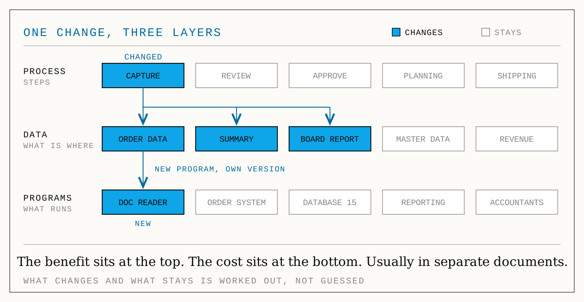
"We're automating order entry" sounds like exactly one thing: a box in the process diagram that switches from hand to machine. Look at what actually gets touched, and that one box quickly turns into two dozen things.
The process changes. Typing becomes checking. That changes the time per case, how many cases one person can handle, and the error rate. And if you are unlucky the queue simply moves one station further along, and nothing is left of the benefit.
The data changes. Each order now carries two extra pieces of information: where the record came from and how confident the machine was when it read it. Both sound harmless. Both end up in a summary view that feeds three reports: one goes to the board, one to the accountants.
The systems change. A new program joins, one that reads mailboxes and pulls data out of documents. It needs somewhere to run, access to the order system, a mailbox with the right permissions. And it comes in a version that has to fit the database you already have.
- benefitThe process: who does what, how long it takes, where it queuesThe layer everyone talks about. This is where the benefit sits: shorter turnaround, more cases, hours saved. It is usually documented, and usually the only one that is.
- effortThe data: what is stored where, and where it came fromThe layer that determines the effort and appears in no document. Which figure is calculated from which, which report hangs off which view, which rule reads which field.
- riskThe systems: which program runs where, in which versionThe layer where things break. Whether the versions still fit each other, whether the vendor still supports them, who is allowed to access what. An overview often exists, but it is two years old.
So the benefit sits at the top, the costs sit at the bottom, and the two live in separate documents. That is the whole reason cost estimates so often come out at half the real figure. It is not carelessness. It is a calculation whose second half was never written down anywhere.
Why two pictures side by side are not enough
Drawing all three things once is not enough. Put the process and the system overview next to each other and you have two pictures instead of one, with the connection between them still in your head. The difference appears at exactly one point: when you change one thing and are shown the consequences everywhere else automatically.
For that, the overview needs three things a drawing tool does not have.
First: connections that mean something. An arrow in a picture means whatever the viewer reads into it. In a useful overview it has to be clear whether data is being passed along, whether there is a dependency ("if A goes down, B stops too"), or whether one figure is calculated from another. The third kind is the most tedious to maintain and the most valuable. It is the only one that lets you trace consequences down to a single field.
Second: versions, in two senses. Once on the individual program: which version is running, and how long the vendor still supports it. That turns an assertion into something checkable, and an end-of-support into a date rather than a nasty surprise. And once on the whole document: today's state and the desired state both have to be captured completely, meaning process, data and systems together. A snapshot that only takes the process with it turns "what has to change" back into a paragraph of prose.
Third: a check that actually calculates. You give it two states, or a single change. What comes back is not a picture but a list:
- What changes: everything the change reaches.
- What stays the same: all the rest. Unusual, and half the value.
- In what order: the affected things sorted the way you have to work through them. Exactly the line that otherwise gets negotiated in a meeting.
- Where it can break: the places where an unspoken assumption no longer holds.
- What it costs: effort per affected place, as a range, in days and money.
The last point is the important one. It puts a change to the technology in the same currency as a change to the process. Both sit next to each other on one sheet and can be weighed against each other.
The most important line reads: stays as it is
Most of the attention goes to what is affected. In practice the opposite question decides it. Anyone who has to approve a change mostly wants to know what will not happen: do the reports keep running as before? Does the handover to the accountants need retesting? Does anything have to be rolled out, and if so, where?
"Nothing needs rolling out" is a sentence that ends a discussion. But it is only worth something if it has been worked out rather than asserted. And this is exactly where most checks fall down, because they work too coarsely.
Take the example above: two extra pieces of information are added to the order. A coarse check simply looks at who reads order data at all and reports all of it. In a landscape that has grown normally, that is two dozen places, and the answer is worthless, because it comes out the same for every change.
A useful check distinguishes two cases:
- Fully affected is something that has changed itself: deleted, renamed, moved, lifted to a new version. Then the change carries on through everything in it.
- Only partly affected is something where only a single field inside it moved. That place goes on the work list, but the rest of its fields have not moved, so nothing carries on through them.
Without that distinction, "one field added" reports every summary view in the building. That is correct when a whole table disappears and wrong when a field is added. And it destroys the list of what stays the same, which is the part that is actually worth something.
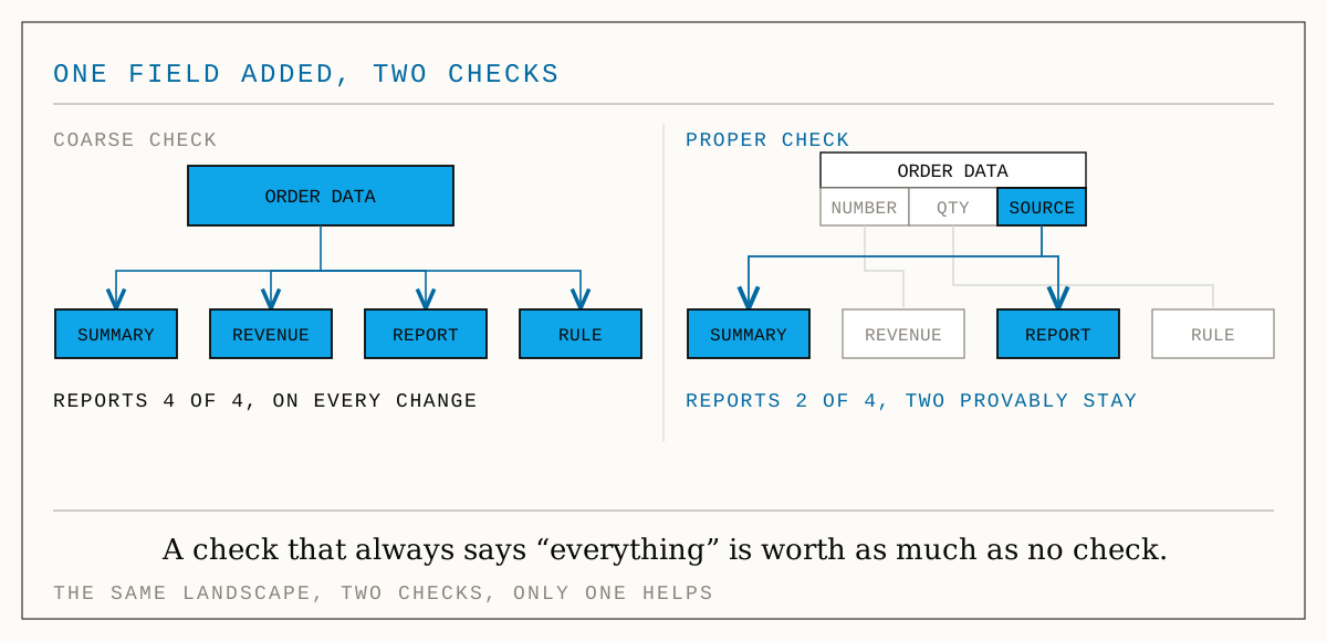
The distance between 22 and 5 is the difference between a check people take seriously and one nobody reads after the second time. An answer that always says "everything" is worth as much as no answer at all.
For connections between whole programs, say "program A calls program B", the cautious assumption still applies: fully affected, because a call like that says nothing about individual fields. That is the honest assumption, not the convenient one.
Those three numbers are the same piece of work somebody does today by hand, in prose, usually without the time to trace every connection properly. That handwork can be automated, and it pays off considerably better than a lot of what ends up on such lists.
The costs nobody plans for
Effort is one item. The other is the places where a change does not become more expensive but wrong. In an estimate made from the gut they fall through entirely, because you only find them by actually walking the connections.
| Pitfall | How to spot it | What it costs when missed |
|---|---|---|
| A number turns into text | A customer number travels as text into a field that expects a number, or the other way round | Runs fine for months and breaks on the one record with a leading zero |
| Required field with no default | A new piece of information is mandatory, has no default value, and there is existing data | The changeover aborts, usually in live operation, usually on a Friday |
| Versions no longer fit | Two programs whose combination the vendor no longer guarantees | A second project that was not budgeted inside the first |
| Personal data leaves the building | A field with personal data ends up, via a summary view, in something that gets exported | A data protection incident nobody would otherwise have noticed |
| Vendor support has ended | A date on the program, nothing else | The most expensive update is the one done under time pressure |
| A calculation with no source | A figure is calculated from a source that no longer exists | A report that quietly returns wrong numbers |
The last row is the nastiest, because it never gets loud. A program that fails announces itself. A report that has been wrong since the changeover does not. It gets read, and believed.
None of this is clever work; it is bookkeeping. Which is exactly why a machine should do it and not a person on a Friday afternoon.
Before any AI project: what you want to know against what you have
There is a second question the same overview answers, and it is the reason most reporting and AI projects turn awkward in week six. A data overview on its own only tells you what exists. That is an inventory. An inventory never tells anyone that the figure they asked for cannot be calculated at all.
The other half is the demand: what somebody wants to know. A figure on a dashboard, a column in a report, a rule, a value an automated step needs. Hold the demand against what exists and every wish falls into exactly one of three drawers:
- Works right away: everything it needs is there and there is nothing against it.
- Somebody has to decide: it is there, but somebody has to sign it off explicitly. Personal data in something that leaves the building. A field that is allowed to be empty sitting inside a rule. A source that is about to disappear.
- Missing: the information simply does not exist. That is not bad news, that is your shopping list.
The reverse direction is just as much an answer: information you maintain that nobody uses. "Uses" should be read generously here. A wrong "nobody needs this" costs somebody a deletion they have to undo.
Knowing about five missing figures at the start costs one conversation. Discovering them in week six costs the schedule.
Where AI helps and where it does harm
Now to the question you may be here for. Typing an overview like this by hand is tedious. Language models are very good at proposing a first structure from a pile of documents. And they are dangerous at exactly the same task. The line between the two is clear and fits in one sentence.
Read out everything that follows a fixed form. The technical description of a database states exactly which tables exist, which fields are in them, and which figure is calculated from which. The setup files of a server state exactly which programs run in which version. The existing drawings contain the boxes your colleagues drew two years ago. In all these cases, replacing an exact text with a guess has not one single advantage. It only makes things less certain.
A language model comes in afterwards, for everything without a fixed form: the system description written as prose, the handover notes, the entry in the internal wiki, the email where somebody explained how the handover to the accountants works. And there under a condition it cannot talk its way past: every proposal has to bring along the exact passage it came from, and that quote gets checked against the source. No evidence, no entry. Not as a polite request in the instructions to the model, but as a check that discards the proposal when the quote is not in the document in those words.
And before anything is taken over, it all goes through a review list: line by line, each one saying where it came from: which file, which line, or blank when a person typed it. An import that can quietly overwrite something makes the whole overview untrustworthy. And an overview nobody trusts is worse than none at all.
There is one thing a language model must never do here, and it is the most important sentence in this section: invent connections. A guessed link leads to a wrong assessment of the consequences. That is not "slightly imprecise", it is worse than having none, because people believe it. Text that sounds plausible is at its most dangerous precisely when it is talking about your own systems. There, nobody notices the difference until something breaks.
That is the whole answer to how to use AI sensibly here: it is very good at preparing the ground and bad at doing the sums. Put it at the beginning, never at the end. The number that ends up on the table has to be one you can check, or it will not survive the first serious objection.
The order to work in
This sounds like a year of preparation. It is not, if you go in the right order and let each stage say "that is enough".
- Start with what you already have. Read in the technical description of your database, the setup files of your servers and the drawings that already exist. That is importing, not recording, and in most companies it already covers the bulk of it.
- Only add what answers a question. Do not map the whole building. The rule: anything that contributes nothing to an answer does not get recorded. Plain drawing is something other tools do better and cheaper.
- Put the process next to it. Which step runs on which program, which step reads which data. That connection is the point at which benefit and effort appear on the same sheet for the first time.
- Capture today's state, put the desired state beside it, read off the difference. Do not debate what has to change, read it off. What changes, what stays, in what order, where it can break, what it costs.
- Play the benefit through instead of promising it. The cost side is now solid. The benefit side becomes solid when you run the changed process once under realistic load.
- Only then do the sums, with no as a permitted answer. Investment against saving, in three variants. What that calculation looks like, and which three numbers in it are almost always set too optimistically, is in "Automating processes: what pays off and what doesn't".
The advantage of this order: each stage is cheaper than the next, and each is allowed to end in "let's not". The most expensive realisation is the one you only have in week six.
What you can work with
The thinking here does not depend on any tool, and you can do it with a spreadsheet and some discipline. All that matters is that process, data and systems sit in one place, with today's state and the desired state side by side. Having to maintain each view separately is the main reason system overviews go stale in companies. And whatever you keep there should go back out as a drawing or an image: I would not use a tool I could not get back out of.
How I see it
I advise, develop and automate, and I look at every undertaking from three sides at once: commercial, human and technical. On this question the three are unusually closely linked.
Commercially it is clear: a change whose cost you only learn after the approval is not a decision. Technically it is just as clear: the cost almost never sits in the process, but in the two layers underneath that nobody wrote down. The third side is the most interesting. Because the real reason approvals stall is rarely money. It is the well-founded worry that something which works today will break. No benefit calculation helps against that worry. What helps is a solid list of what you are not going to touch.

